Yesterday, I posted an article about Controlling Preview Features in VSTS. In that article, we saw how you could enable the new VSTS account landing page experience. Not only does this change the landing page experience but it also updates the icon in the upper left hand portion of the menu bar as shown below.
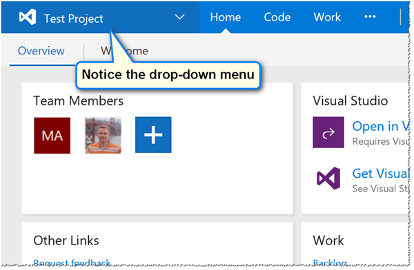
Before the new experience:
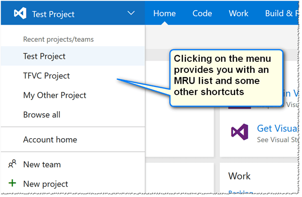
You can see the drop-down menu in the above screenshot for the “old” experience. You can also see the contents of the drop-down menu below, which includes a most-recently used (MRU) list of team projects.
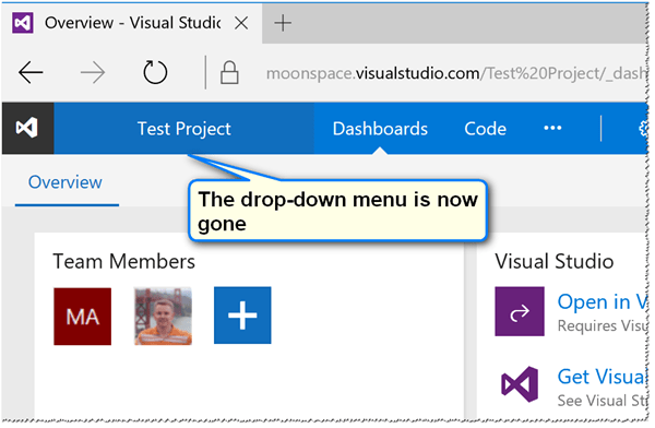
After the new experience:
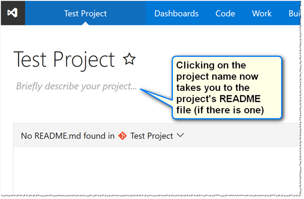
Once you enable the new experience, you can see that the drop-down menu no longer exists, as shown in the screenshot above. Clicking on the project name simply takes you to the read me markdown document for the project – if one exists.
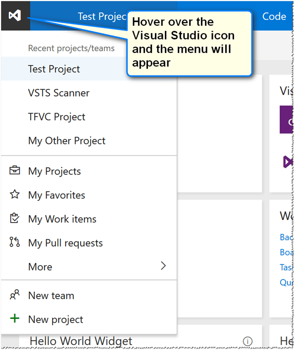
However, the MRU list still exists. It’s just not as obvious as it used to be. If you hover your mouse pointer over the Visual Studio icon in the upper left a menu will appear as shown below.
This is not intuitive and it doesn’t work very well on tablets. Note: on a tablet, if you tap-and-hold the Visual Studio icon for about half a second or so it will display the menu. It also tends to display the browser’s context menu as well because it thinks you’re right-clicking. It does work – just not very well.
Being that this feature is part of a preview it is possible that Microsoft will make changes to the behavior. However, in the meantime, you might benefit from knowing that it at least exists for the time being and might save a mouse click here and there ![]()
I’d be curious to hear your thoughts on the “discoverability” of this feature. If you have any thought, please leave them in the comments section below.

Comments are closed.