So, it’s been just over four months since I switched to Android (from Windows mobile) and I’ve slowly but surely been learning to live within the Android ecosystem. While I still appreciate the vast selection of apps available in the Google Play Store there are still plenty of things I’m not overly excited about when it comes to Android. In my post, Android:Two Weeks In, I talk about the Good, the Bad and the Ugly. While I can’t resolve all the “bad and ugly” issues, I’d like to highlight one app that has helped me cope a bit better than I would have otherwise ![]()
3…2…1… Launch!
One of the best features of Windows mobile is the various ways you can size and arrange the tiles on the home screen. I also loved the ability to swipe to the left to see a list of all the installed apps for easy search-and-launch. While the default launcher on my GS7 allowed a bit of customization it just doesn’t compare to what can be done in Windows mobile (IMHO).
That said, one feature that Android has that Windows mobile doesn’t is the ability to switch out the default launcher (essentially the “home” screen and how you launch apps). Enter Launcher 8 WP Style. This launcher attempts to bridge the gap between Windows mobile and Android. While it isn’t perfect, if you’re moving from Windows mobile to Android, I’d highly recommend checking this launcher out. There are several Windows mobile style launcher available in the Google Play Store but this one seemed to be the most full featured and customizable.
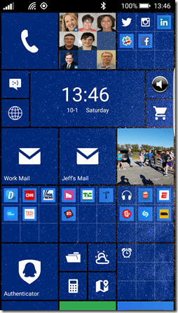
To get a feel for what this launcher can do, here are some screenshots of my GS7 Edge:
If I hadn’t mentioned that this screenshot came from a GS7 your initial instinct likely would have been that it’s from a Windows mobile device!
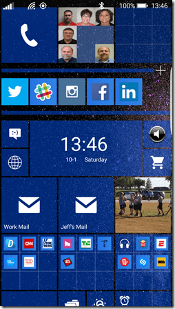
Here’s another view of the same screenshot with the top right “folder” expanded:
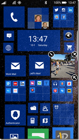
You’ll notice that this folder does not have a name associated with it. That is because the current version of this launcher does not yet allow you to name folders (I’ve made that request ![]() ). You’ll also notice that I have tiles of varying sizes on the screen. The ability to move and resize tiles works pretty much the same way it does in Windows mobile – you tap and hold until the tiles go into “customize” mode:
). You’ll also notice that I have tiles of varying sizes on the screen. The ability to move and resize tiles works pretty much the same way it does in Windows mobile – you tap and hold until the tiles go into “customize” mode:
While you can’t see it in the above still image, the tiles are even moving about, ever-so-slightly, to give them the same “floating” effect you see in Windows mobile. Cool!
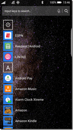
And, if you swipe to the left, you’ll see your installed apps:
From here, you can tap and hold to get a context menu that looks just like the one you’d get on Windows mobile allowing you to pin an app to the start screen or uninstall the app. In fact, this particular launcher lets you switch the app list mode to one of several different formats (something you can’t do in Windows mobile).
This only scratches the surface of this launcher. It has all sorts of customization features that you can play with and even has the ability to save your overall layout as a theme which can be shared with others if you like. There are lots of shared themes available that you can choose to download and apply if you want to start with an existing theme and tweak it from there.
While I’ve only been using this launcher for about two weeks, so far, I am happy with it. I haven’t done any formal experimentation on power consumption so I can’t say if this launcher has any negative impacts on battery life but I haven’t noticed anything as of yet.
At any rate, while I would still love to live in the Window mobile ecosystem, I am finding that with the right apps I can at least live comfortably (mostly) within the Android ecosystem.
Other Apps
There are several other apps that I’ve discovered over the course of the past few months that have eased my transition to Android. If that is something that is of interest to anyone, leave a note in the comments section below and I’ll consider doing a few posts on those as well ![]()


